The Neglected Art of Timelines
“Perhaps it doesn’t understand English,” thought Alice. “I dare say it’s a French mouse, come over with William the Conqueror.” For with all her knowledge of history, Alice had no very clear notion how long ago anything had happened.
Lewis Carroll, Alice’s Adventures in Wonderland
One of the challenges of teaching history, I am told, is getting across the length of time between events. It is all too easy for the past to feel like a bundle of actions happening at once, instead of a slowly unfolding story. Perhaps this isn’t surprising, as we tend to view our own lives the same way: a series of representative experiences, ignoring duration.
So to help pupils understand history, Ofsted (the UK school inspector) wants them to build “mental timelines”. Memory author Lynne Kelly thinks school corridors should be turned into timelines.
But timelines are a neglected art! Tragically, history books hardly ever contain them. I think this should change.
Why dates need graphics
In general, as humans we are not good at lists of numbers. If someone hands you a table of data, you are unlikely to understand the sizes and patterns. This is why we use graphs and charts: we are much better at interpreting colours and shapes than raw numbers. These days “telling stories with data” is a hot topic, yet when it comes to history, we often still use lists of dates.
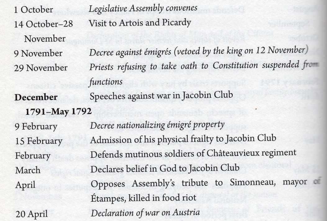
This “chronology” is from a biography of Robespierre. This is a good book and the chronology is fine as far as it goes: lots of detail, and decent use of typefaces to distinguish Robespierre’s actions from background events.
But there is no visual sense of time duration. How long was Robespierre travelling? Did Robespierre start speaking against war nearer the start of the Legislative Assembly or nearer the end? Was all of this during peacetime? Without a graphical timeline, it’s hard to answer these questions. You have to do lots of mental calculations, instead of using a visualisation where you could just tell at a glance.
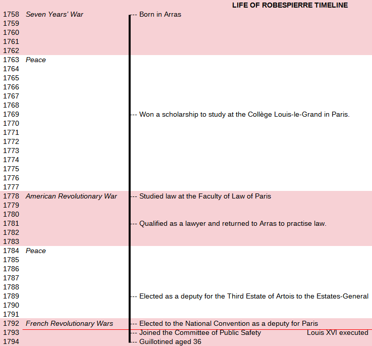
Surely it would be much better to have a timeline like this at the start (or end) of the book, and then each chapter can get its own zoomed-in timeline covering a shorter period. It is quite common for books and TV programmes to do this with maps. Why not timelines as well?
I am not saying this timeline is perfect. I just threw it together in LibreOffice Calc. But already I can see a lot of information I didn’t intuitively understand from reading the book, such as the duration of the wars, and the way that so many key revolutionary events were crammed into the final three years of Robespierre’s life.
Also, borrowing a common technique from graphs, we can use background colours and lines to signify key events that aren’t directly about Robespierre. Other techniques that could be borrowed from graphs include secondary scales to show dates in two different calendars, and parallel lines to show additional timelines (e.g. two biographies) on the same dates and background events.
Ordinal v scaled timelines
When I do see timelines, they are often just “events connected by a line” that don’t use the line to measure time. I have seen two sites call these “sequential timelines”, but I think a better name would be ordinal timelines, as they are like ordinal numbers (1st, 2nd, 3rd). Ordinal timelines show the order of events, but the spacing between them carries no meaning.

Ordinal timelines have their uses, where dates are uncertain or unimportant. The example above (from RSPB magazine Summer/Autumn 2021) is an attractive way to list events for which the timings don’t matter much. They are also easy to produce. But, to solve the problem of understanding history, I am more interested in scaled timelines: timelines that use the distance along the line to represent elapsed time.

The Premier League offers some great scaled timelines of its football matches. Above is a game between Arsenal and Brighton. It is easy to get a sense of what happened: a relatively quiet start, followed by a Brighton goal, a flurry of yellow cards either side of half time, a second Brighton goal, substitutions from both sides, before Arsenal pulled one goal back. The timeline uses intuitive symbols, placed above and below the line, to visually tell a story. Recently I have noticed Amazon Prime does a similar thing on the progress bar of its match broadcasts, so you can click through the highlights.
When designing a timeline, it should be obvious whether the reader is looking at an ordinal or a scaled timeline. (In other words, whether the events are just in sequence, or using the line as a scale.) I am not so keen on the timeline below.

At first glance, this looks like a scaled timeline, with each event linked to a precise point on the line… yet when you look closely, the distances between events are unrelated to the dates. 1961 appears twice with a huge gap!
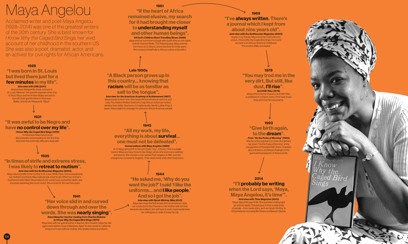
This timeline from the same book is better, because it is obviously ordinal: the arrows connect the events, rather than pretending to be a scale.
Timelines in the wild
Most timelines run left-to-right, but it can be equally effective to draw them top-to-bottom or bottom-to-top. Vertical timelines have the advantage that we can write the text labels horizontally, and they are a better fit for a book page or phone screen.
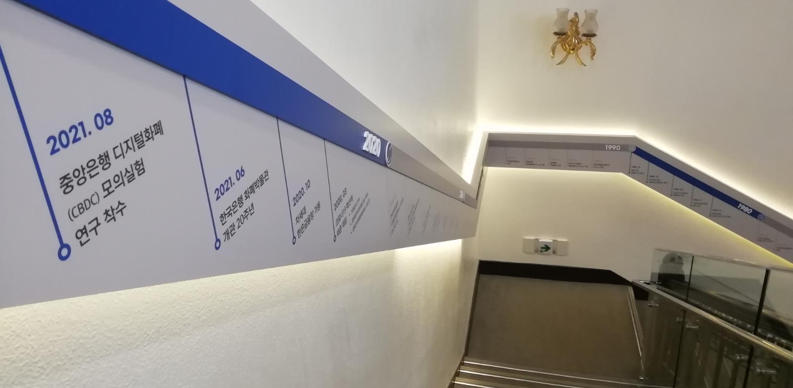
I used to think timelines are never drawn right-to-left, until I came across this wall display in a Korean museum:
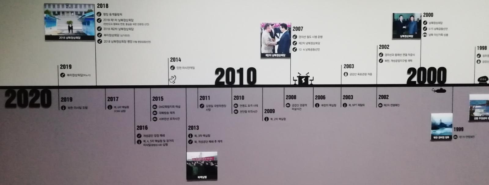
On a blog post, this right-to-left layout looks bizarre. But visitors pass through this part of the museum from right to left, so the physical experience works really well. As you walk along the timeline, your journey takes you through time. (In fact, many museums work a bit like this if you walk from room to room in chronological order, although the walking distances will not be to scale.)
And why stop at corridors? Here is a timeline that makes use of dead space in a stairwell.
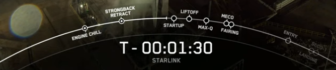
The company SpaceX shows a timeline on its launch videos. This timeline is curved, mirroring the shape of a planet or orbit, and brings different events into view as it pans round.
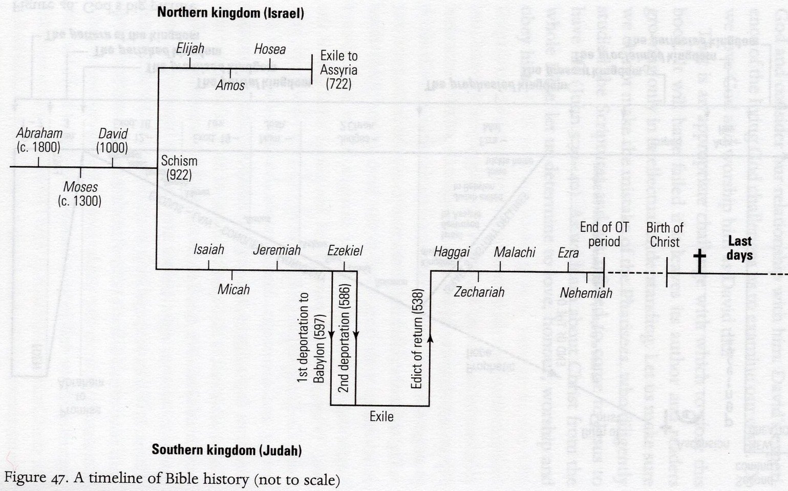
Sometimes you can be even more inventive with the shape of the line. The example below splits into two, to show the kingdom of Israel splitting into Israel and Judah. The two branches are then shown in parallel. There is additional use of vertical space to show Judah going into exile.
Funnily enough, the best use of timelines I have seen in print doesn’t come from a history book at all, but from a book about Revelation.
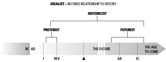
Here, the timeline is used to illustrate different interpretations of Revelation, and elsewhere the same timeline is used to show which historical periods different passages may refer to.
Although timelines are sadly rare in history books, you can often find them in company reports.
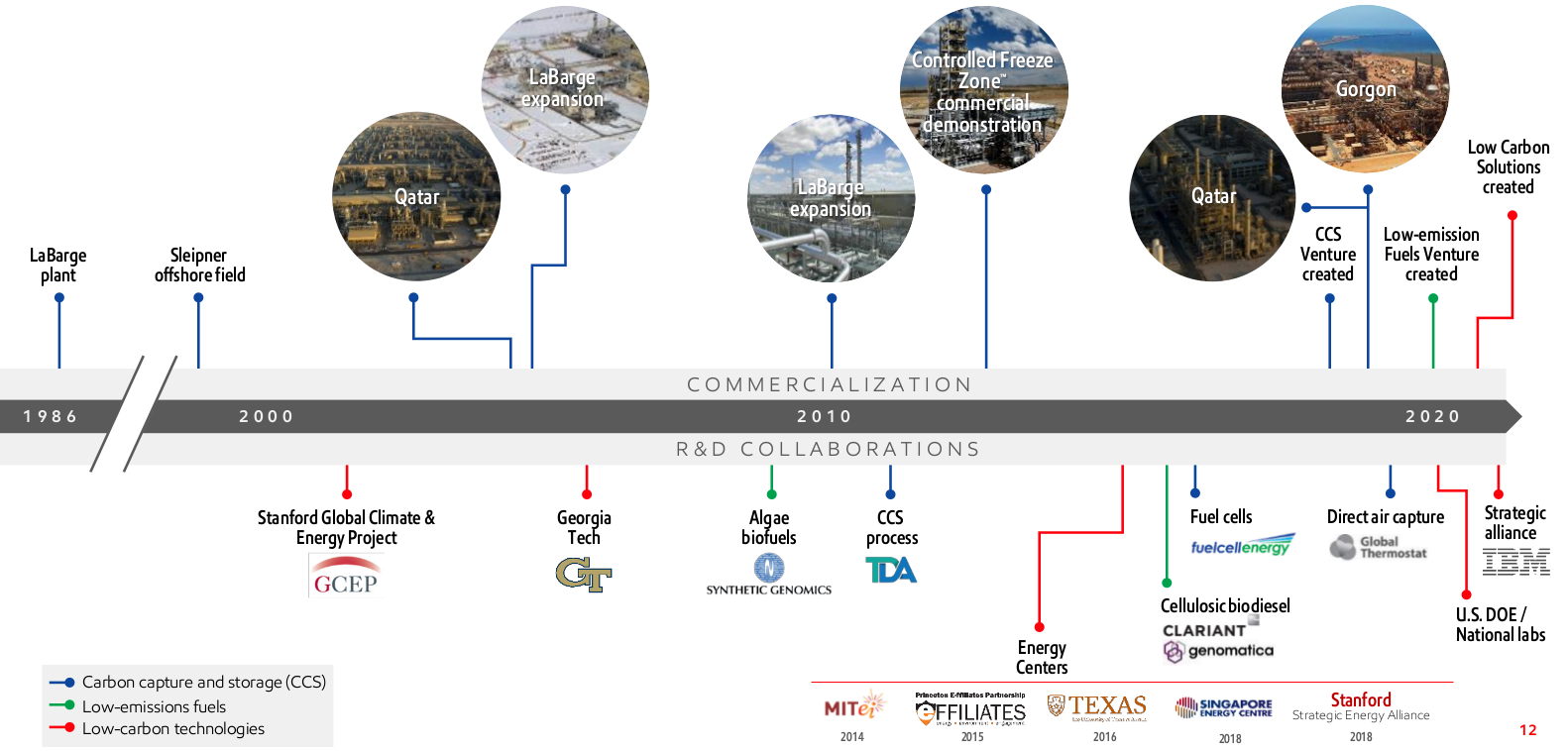
This timeline from the energy company ExxonMobil is a mix of good and bad design. On the plus side, it places different types of label above versus below the timeline, and uses three colours of connector lines to show different meanings (albeit not the most accessible palette for colourblind people). It also uses the whole page well, putting joints in the connector lines to avoid labels overlapping. But it has one major flaw: the timeline has no precise dates or tick marks, so it is impossible to tell when the events took place! The carefully angled connector lines are completely wasted. All scaled timelines should have clear dates (or times), either in the labels or with tick marks on the line itself.
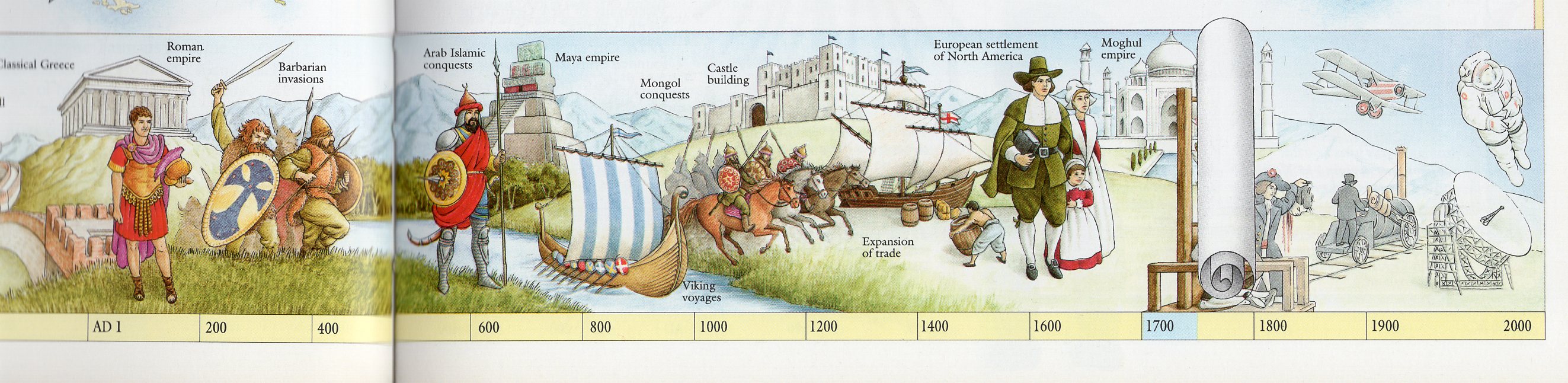
Finally, I want to mention artistic timelines. These can sometimes be found in children’s books, which is unfair on adults because they are beautiful to look at. This scroll unrolls as you move through the book.
And here is another Dorling Kindersley (ordinal) timeline, showing the development of castles and forts. The illustrations add a lot to this timeline, as you can see the changes in architectural style. The dates, however, are hard to follow because of the winding line.
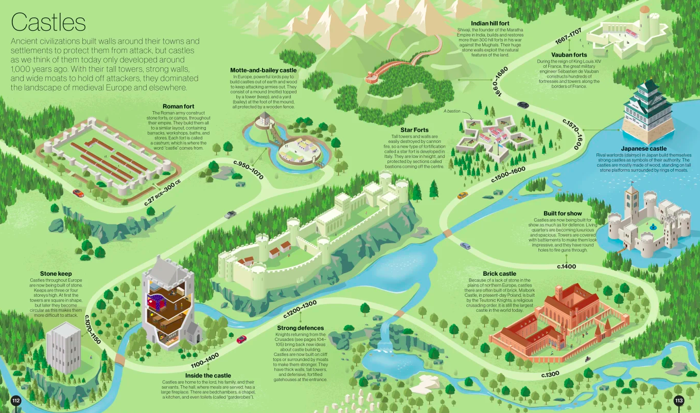
Timelines like this are beautiful but clearly a novelty. I would like to see simple timelines (with background shading) used routinely in adult history books, not just confined to fun books for children. This would make it much easier to understand how history unfolded through time.